Gettin Sketchy – Drawing a Robin with Pastels – Season 3 Episode 3
This episode aired live on YouTube on February 3, 2021.
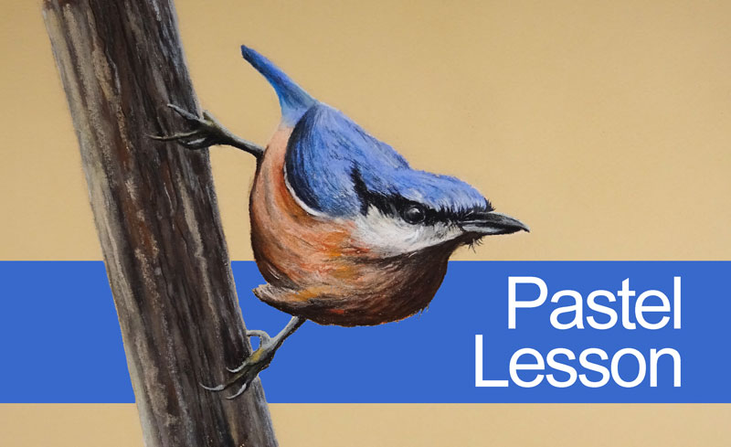
In this timed drawing exercise, we’ll take a look at drawing a colorful bird (a European Robin) with pastels and pastel pencils on orange Canson paper. We’ll work to complete the drawing within 45 minutes. This means that we’ll need to work quickly, blocking in basic shapes of value before developing details with the remaining time.
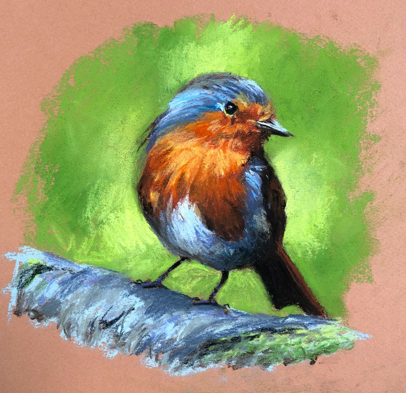
Here’s a look at the completed image…
Starting Sketchy and Loose
We’ll first need to sketch the bird and to do this – we’ll use a brown pastel pencil. You can use any color you wish to sketch out your subject, but I would recommend sticking with a neutral. However, Black can be too strong and white often doesn’t provide enough contrast. I have found that light to medium browns are often a good choice.
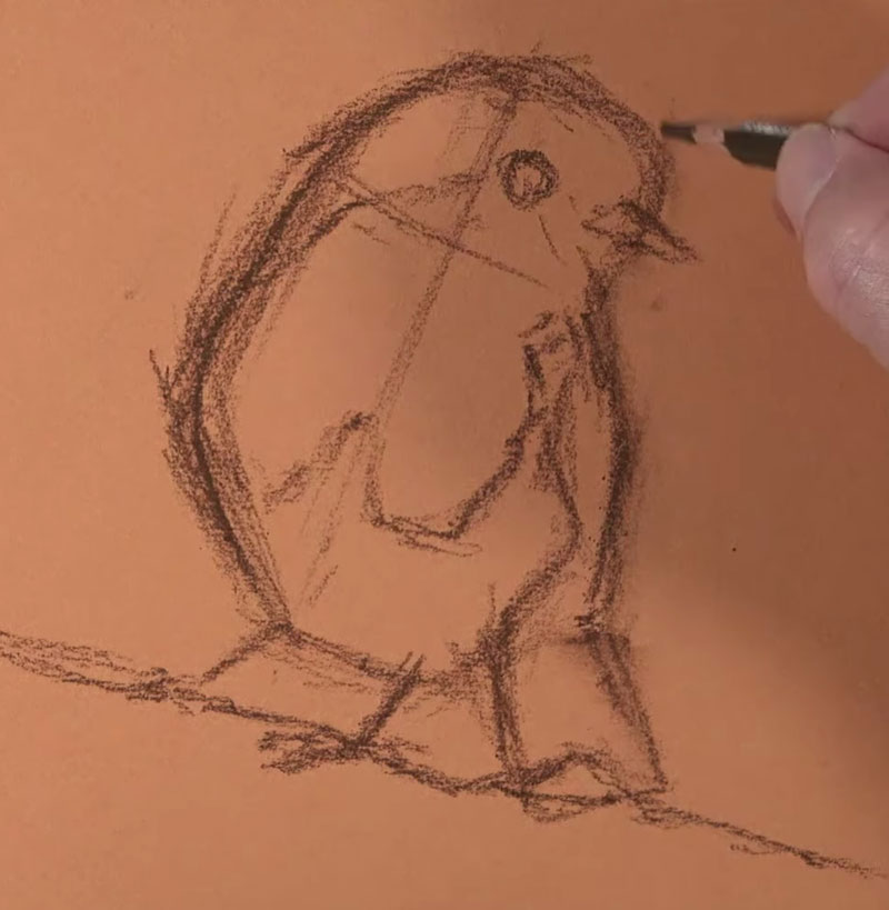
We’ll keep the sketch loose, holding the pencil lower on the shaft. Using a looser line helps us to find the “right” line. Pastels are naturally a looser medium, so be careful not to get too “tight” and controlled with your sketch.
See also: Drawing Basics – Construction
Blocking in Basic Colors and Values
Although pastels are clearly a drawing medium, finished works are often referred to as paintings. One reason they are referred to as paintings is the look of the finished work. Pastel works are very similar in appearance to traditional paintings created with opaque painting mediums like oils or acrylics. But more importantly, the thought process of the pastel artist is similar to that of the opaque painter.
Colors and values are often “blocked in”, much like an opaque painter would do. Since pastels are easily layered, we can cover previous applications or slightly alter them as more colors and values are added. This ability to layer and cover makes pastels more versatile than other color drawing mediums like colored pencils.
This means that we can make quick decisions and work loosely, even as we layer shapes of color. The details can be applied right over the top, much later in the process.
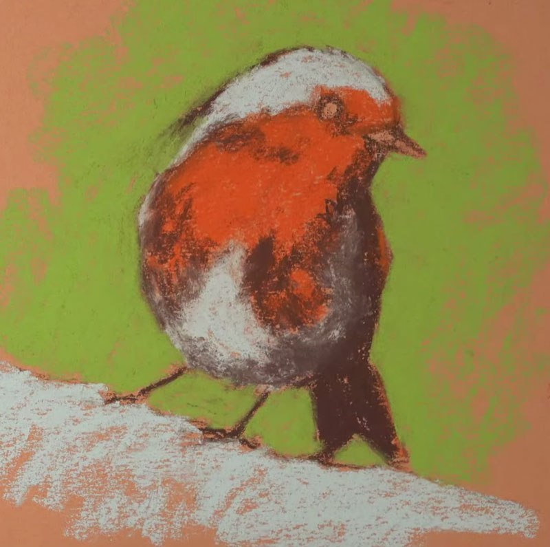
For this painting, I decided to simplify the bird into three or four basic shapes of color. A lighter blue-gray, a medium orange, and a dark brown were used to create these initial shapes. This was followed by a medium yellow-green for the background.
Variety within the Basic Shapes
With the basic shapes of color in place, we can gradually pull out the details. Details such as texture are developed by adjusting the contrast of values. By gradually layering additional shapes of similar colors that differ in value, we begin to pull out the details. We also add depth to the color as we layer.
For the light gray areas on the bird, light blues, purples, and dark grays are layered. For the belly of the bird, a bit of the dark brown is layered to create a shadow. On the breast of the Robin, lighter yellows are layered where the light is strongest. In the area of shadow, a darker, earthy red is layered. Some dark brown is also used here to deepen the shadow.
In the darkest areas, like the wing and eye, a black pastel pencil is applied. Black is an extremely strong color, so we must be careful that it doesn’t flatten the image by using it too liberally.
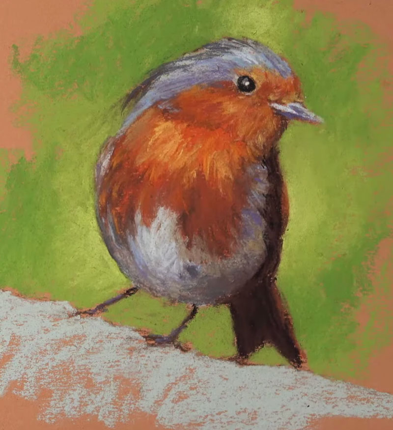
The background is also pushed by applying darker greens and lighter yellow-greens.
As we continue to layer related colors of different values, the image begins to make more sense and the details slowly emerge.
The Importance of the Paper
As is the case with any work, the surface is important. The surface is the foundation of your work and choosing a surface that limits your medium can have a detrimental effect on the finished work. Even though this image is a quick sketch, I choose to work on a quality surface.
In this case, the drawing was created on Canson Mi-Teintes pastel paper. This paper features two distinct surfaces that can both be used to apply pastels and other similar mediums. One side of the paper features a noticeably heavier tooth (texture). The other side of the paper is more textured than most drawing papers, but is less textured than the opposite side.
The texture of the paper is a good indication of how many layers of color you’ll be able to layer. Generally speaking, the heavier the tooth or texture – the more layers of pastel you’ll be able to apply. Since this drawing was a sketch, I choose to work on the less textured side. In this case, I knew I’d be limited in the layers I could add because of the time constraint.
See Also: All About Drawing Papers
Now you may be wondering why I choose orange paper. I often receive questions regarding paper color choice when the color of the paper is not your standard white or gray.
Generally, my choice of paper color is dependent on the color temperature I want the final drawing to have. In this case, the scene is very warm, with bright yellow-greens and oranges. Since I know that small bits of the orange paper are likely to show through the pastel layers, choosing an orange keeps the drawing “warm”.
People tend to overthink the choice of paper, so don’t dwell too long with it. When choosing a colored surface, other than a neutral, just think about color temperature. If you want a warmer image, choose a warmer paper color. If you want a cooler image, choose a cool paper color. If you’re unsure, or if you want to make this decision as the drawing develops, then consider a neutral surface.
See also: 6 Reasons to Draw on Toned Paper
Photo Reference
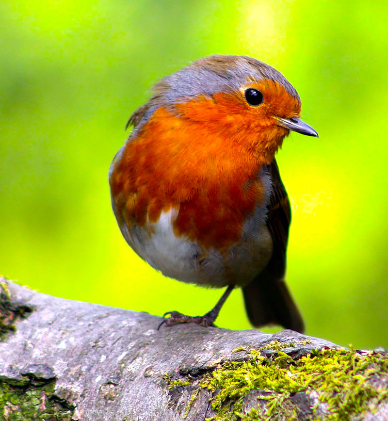
The photo reference for this drawing comes from Pixabay.com. This image was edited by intensifying the colors and values in Photoshop. You’ll also notice that I choose to include the missing leg in the drawing. By leaving the leg out, as it is in the reference, the image wouldn’t translate in a natural way.
Here’s a look at the photo reference…

Materials Used in this Drawing Exercise
Pastels and pastel pencils were used to develop the drawing. As we have discussed before, Canson Mi-Teintes paper was the drawing surface. The pastels used are Rembrandt pastels. These pastels are pricey, but worth the extra price. The pastel pencils are by Carbothello. These pastel pencils are harder than traditional soft pastels but soft enough so that they can still be layered over. I also used a few NuPastels which are considered hard pastels.
Here are a few links to pick up these materials… (The following links are affiliate links which means I make a small commission if you purchase at no additional cost to you.)
Timed Drawing of a European Robin – Conclusion
Practicing is an important part of developing any skill and drawing is no different. For many of us, practice comes in the form of drawing with graphite pencils in a sketchbook. And while this type of practice does help to improve our skills, there are benefits in trying different mediums on different surfaces – especially those that require a different approach to drawing than we are used to.
Pastels are actually a wonderful medium for practice due to the speed at which a painting can be developed. They force us to analyze color/value and think in terms of shape which are skills that not only improve our drawing skills but also carry over to painting.
If so, join over 36,000 others that receive our newsletter with new drawing and painting lessons. Plus, check out three of our course videos and ebooks for free.